Transforming Sleeper from a niche fantasy football app into a comprehensive multi-sport super app — rebuilding navigation, content architecture, and visual identity from the ground up.
Background
Sleeper began as a fantasy football platform and built a loyal user base around the NFL season. To drive year-round engagement, it expanded beyond football to offer fantasy leagues and channels across multiple sports, along with real-money daily fantasy sports.
As the product expanded, the app’s architecture began to show its limits. The three-panel layout, optimized for fantasy football, struggled to support this broader range of activities.
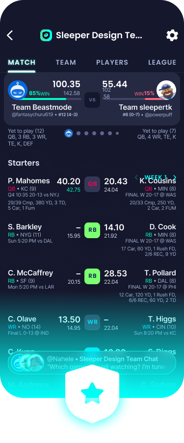
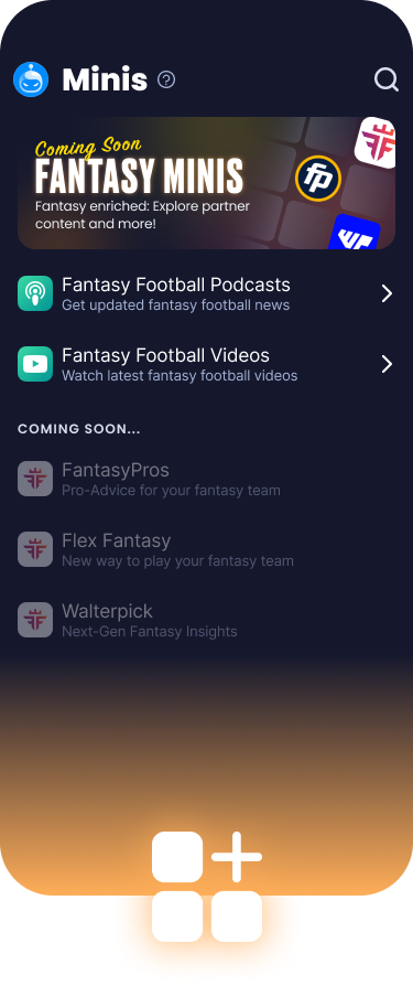
Center panel — the main content area, like a live matchup.
The existing app followed a panel-based model: a center canvas for core activities (such as a selected league or channel), with a left swipe revealing navigation and a right swipe opening supporting tools.
Full-screen swiping made one-handed navigation effortless, with gestures accessible anywhere on the screen.
The layout worked best for a product with a single core activity. As more sports and gaming verticals were added, the three sliding panels became cluttered, making these offerings harder to discover.
Key Challenges
Sleeper’s user engagement was closely tied to the NFL calendar. To drive year-round growth, the product needed to encourage daily engagement with a broader range of sports and content.
Because navigation was buried in the side panel, users lacked clear cues for exploring other offerings, leading to onboarding friction and more support inquiries.
Initial Exploration
To transform Sleeper from a fantasy football app into a comprehensive multi-sport ecosystem, we needed to rethink its structure and create a framework that could scale across sports.
My initial approach was to organize activities into dedicated sport verticals (Football, Basketball, Baseball, and Soccer). This created a modular, repeatable template that could be reused to launch new sports.
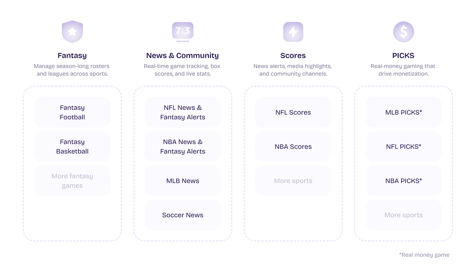
I developed several concepts based on this model and tested them with stakeholders.
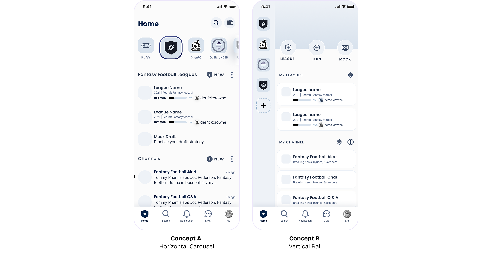
While this approach neatly compartmentalized features and provided a clear structure for future sports, it had two critical architectural shortcomings:
Sports fans rarely consume content within isolated sports silos. Requiring users to choose a sport first conflicted with their natural browsing habits, such as checking live scores across leagues and sports.
Nesting activities within sports created deep navigation trees that would become increasingly difficult to navigate as the sports catalog expanded.
Taking a Step Back
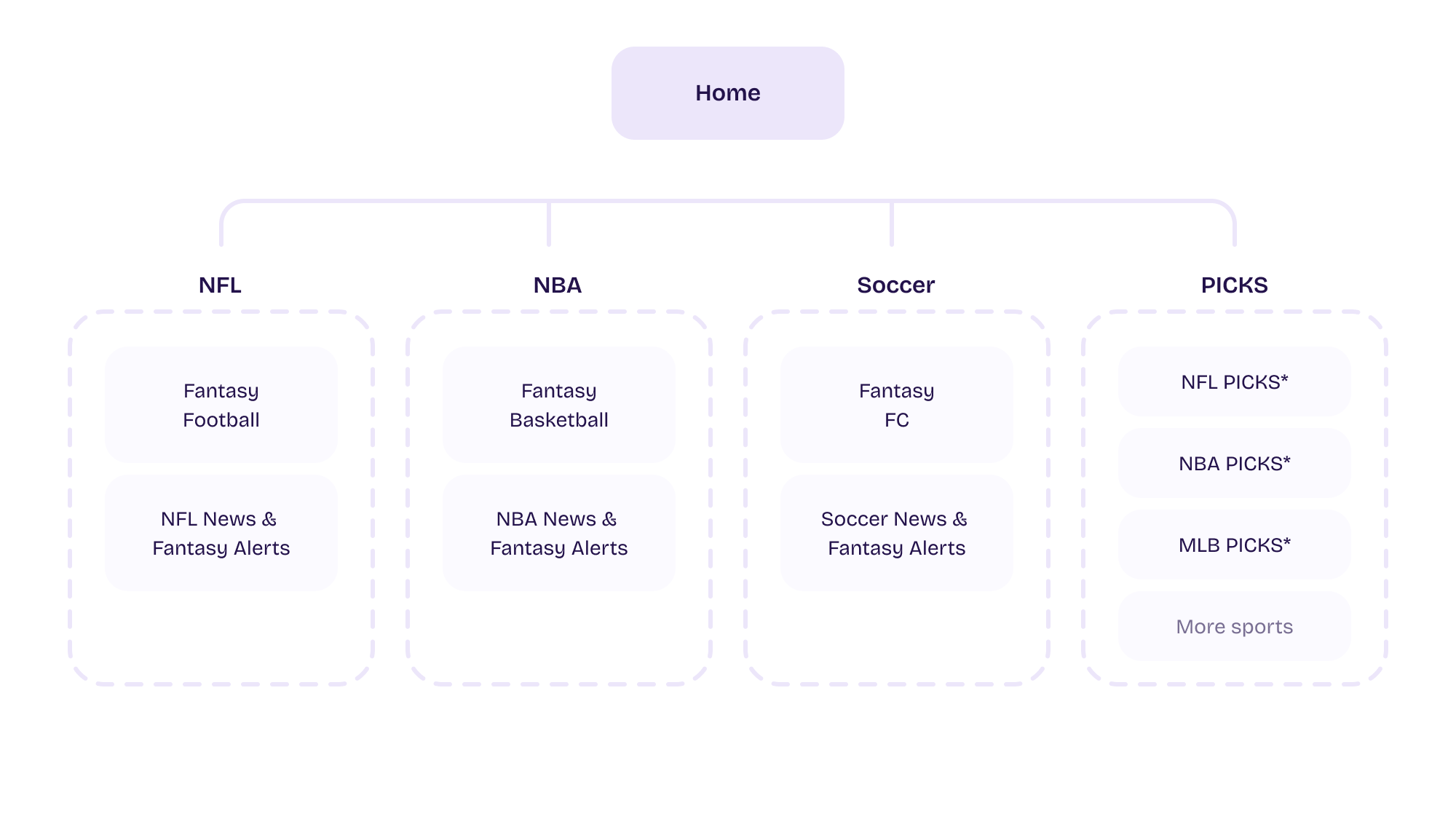
Based on the feedback, I realized we needed to focus on sports fans’ day-to-day needs, not how Sleeper’s offerings were organized. To move from a feature-first to a user-first mindset, I held a team workshop to map fans’ weekly routines, habits, and core needs. By mapping those needs to our offerings and business goals, we identified four essential pillars:
Final Solution
01
Replaced the complex three-panel navigation with a familiar bottom tab bar pattern. This empowered users to seamlessly switch between core sports activities and implemented a scalable architecture that could connect diverse sport activities.
02
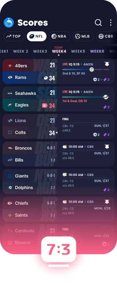
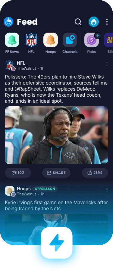
I designed two new tabs, Feed and Scores (credit for the game detail page: Tyler Kung, product designer). These tabs gave sports fans reasons to open Sleeper even on days without games.
03
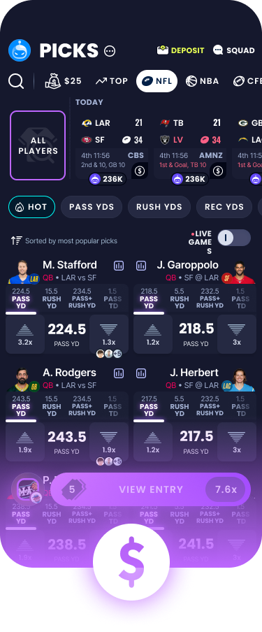
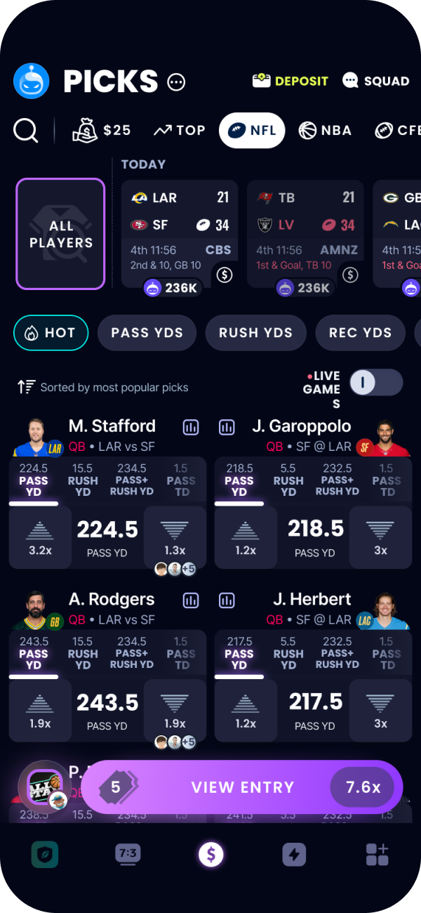
Gives Sleeper PICKS—the revenue-generating feature—prominent, front-and-center placement, making it easy for PICKS-only users to find without distraction and improving discoverability.
04
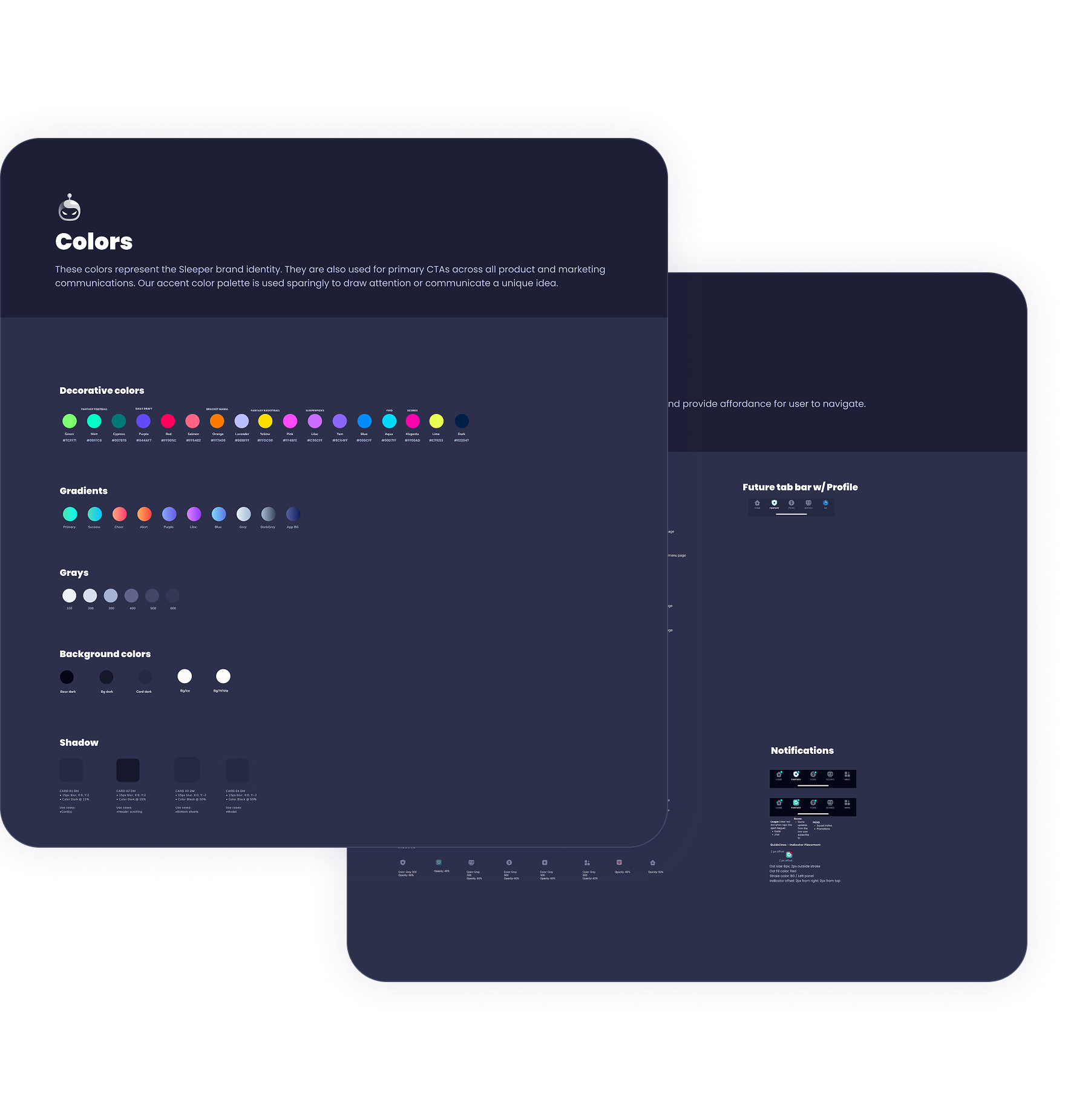
Established a comprehensive Figma library that reduced implementation friction and accelerated delivery for design and engineering teams. It ensured consistency across components, tokens, and patterns throughout the platform and across sports.