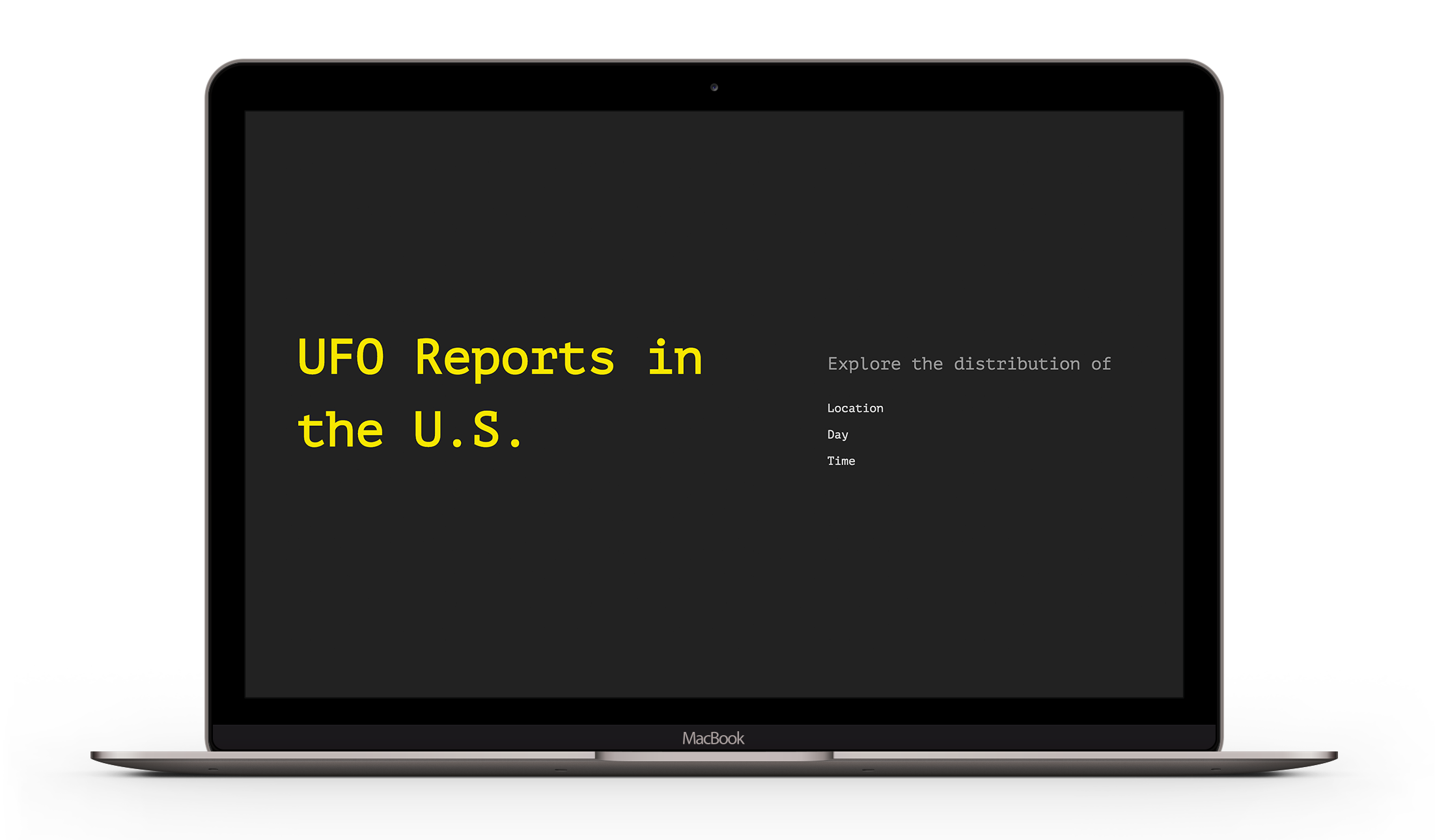
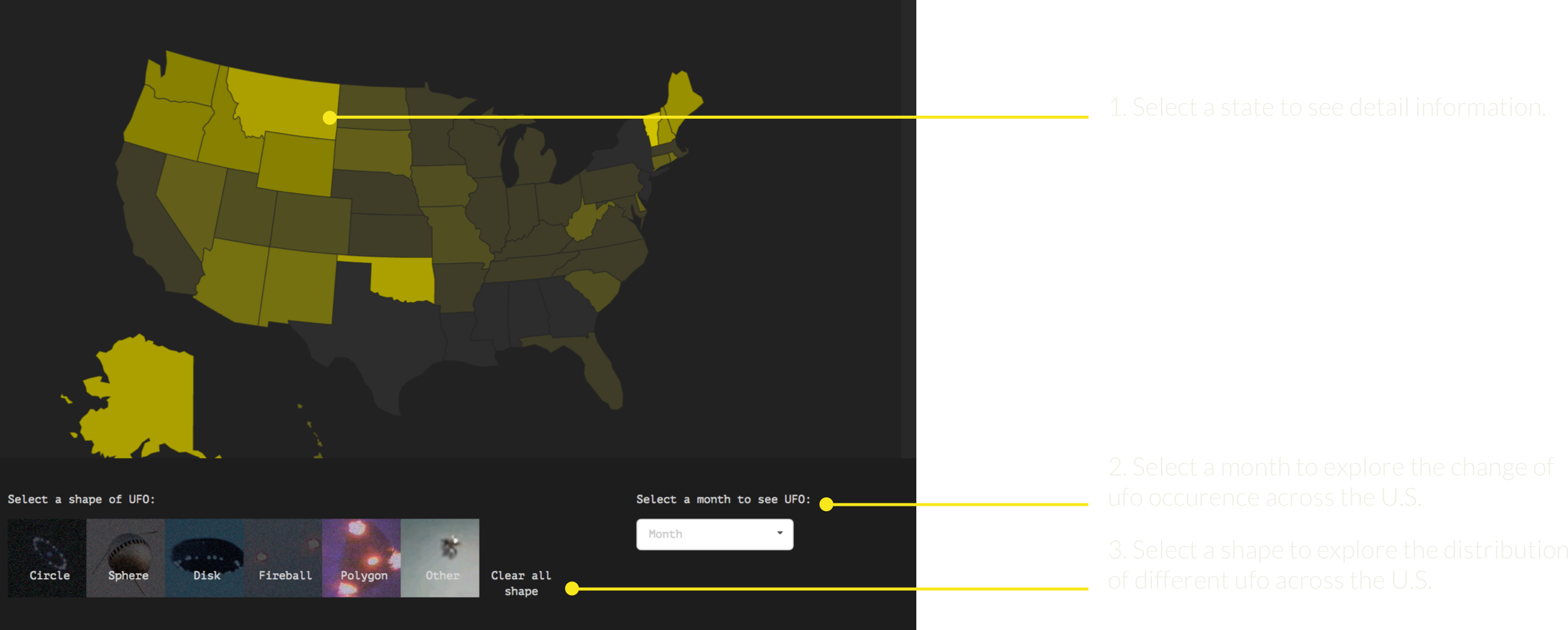
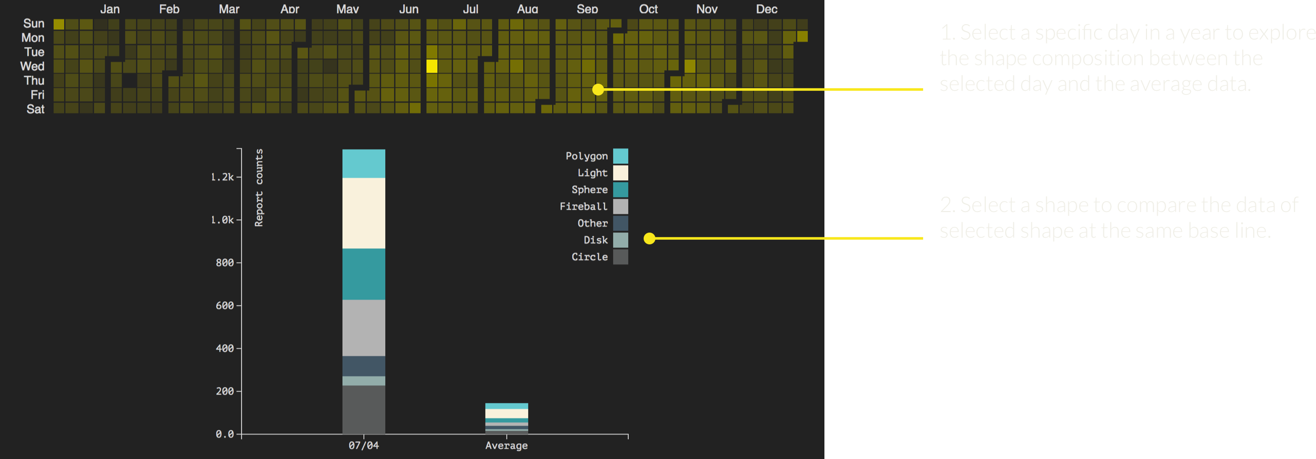
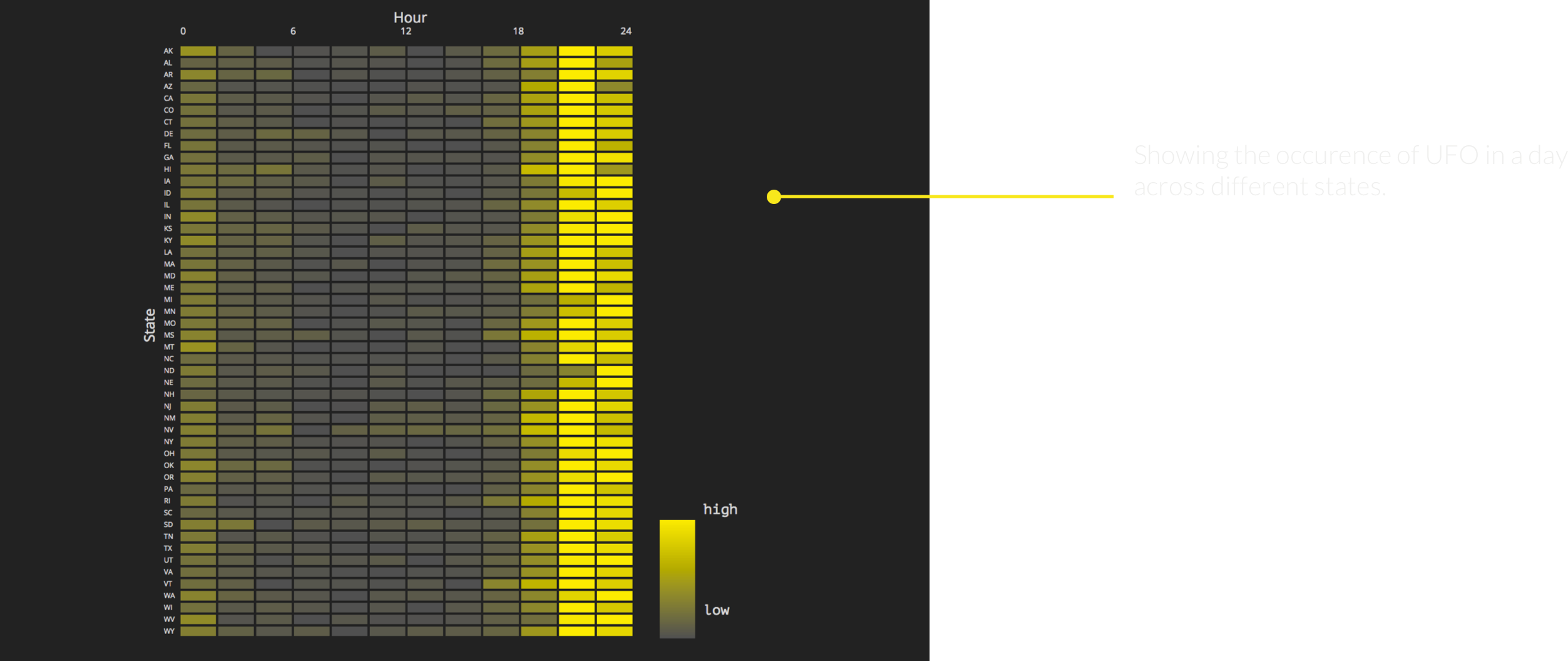
UFO

Visualizing UFO Reports in the U.S. and providing analytical insights.

Project Overview

The National UFO Reporting Center accumulated UFO reports in the United States for over 60 years. Our visualization aims to help analysts who are interested in the database find interesting insights.

My Role

Analyst
Developer

Skills

D-3
Jquery
JavaScript

Context and the Challenge

UFO is a fascinating topic for the general population that raises many discussions and debates. The national UFO reporting center has a comprehensive database that documents all the UFO reports for decades. However, it is hard for the analysts to identify the overall pattern of different variables in the original dataset. We built a set of visualizations that shows the general pattern of the ufo reports dataset. By organizing the UFO reporting data based on location, day and time, we present the information via a map, a calendar accompanied by a bar chart and small multiples of heat maps.

Helping People to have a better chance to spot an UFO

There are many ways to visualize the dataset. To narrow our scope and create practical visualization, we decide to give our visualizations a goal: helping people to have a better chance to seight an UFO. We analyzed the information that people might be interested according to our goal and came up with three dimensions:


Where?
Which day?
What time?

Visualizations

Q1: Where has the most UFO reports?

visualization 1


Q2: Which day in a year has the best chance to sight an UFO?

visualization 2


Q3: What time in a day has the highest UFO occurrence?

visualization 3