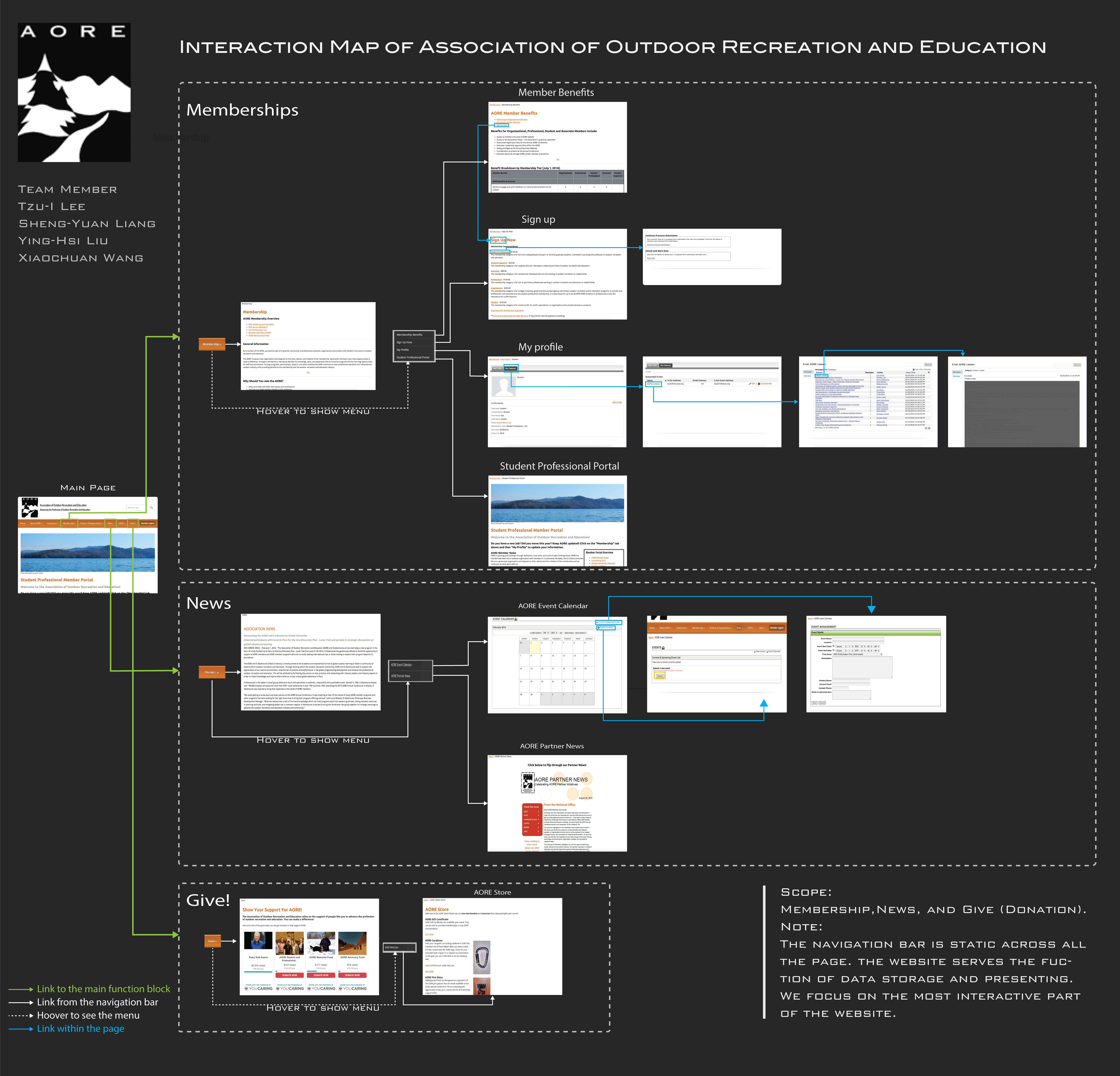
Dissecting the Website - Interaction Map
Based on the clients’ Information, we focused on three main interactive functions of the AORE website, which are Membership, News, Give.
Website Usability Evaluation for Association of Outdoor Recreation Education
The Association of Outdoor Recreation and Education is an association that provides services to professionals and students in the field of outdoor recreation and education. The organization will adopt a new system in April. In order to improve their website interface, they asked our group to find out the user’s thoughts and needs.
Dec. '15 - Mar. '16
UX Researcher
Project Manager
Comparative Analysis Interaction Map Interview Survey Usability Testing
Based on the clients’ Information, we focused on three main interactive functions of the AORE website, which are Membership, News, Give.
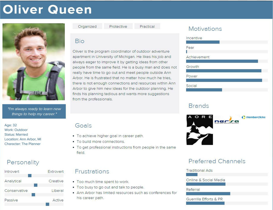
The client wanted to know how they could improve the website. Interviews help us understand the users’ needs. We interviewed 3 current users and 2 potential users, and discovered many discrepancies between the stakeholder’s expectation and the user’s needs.
We summarized three key findings after the interviews:


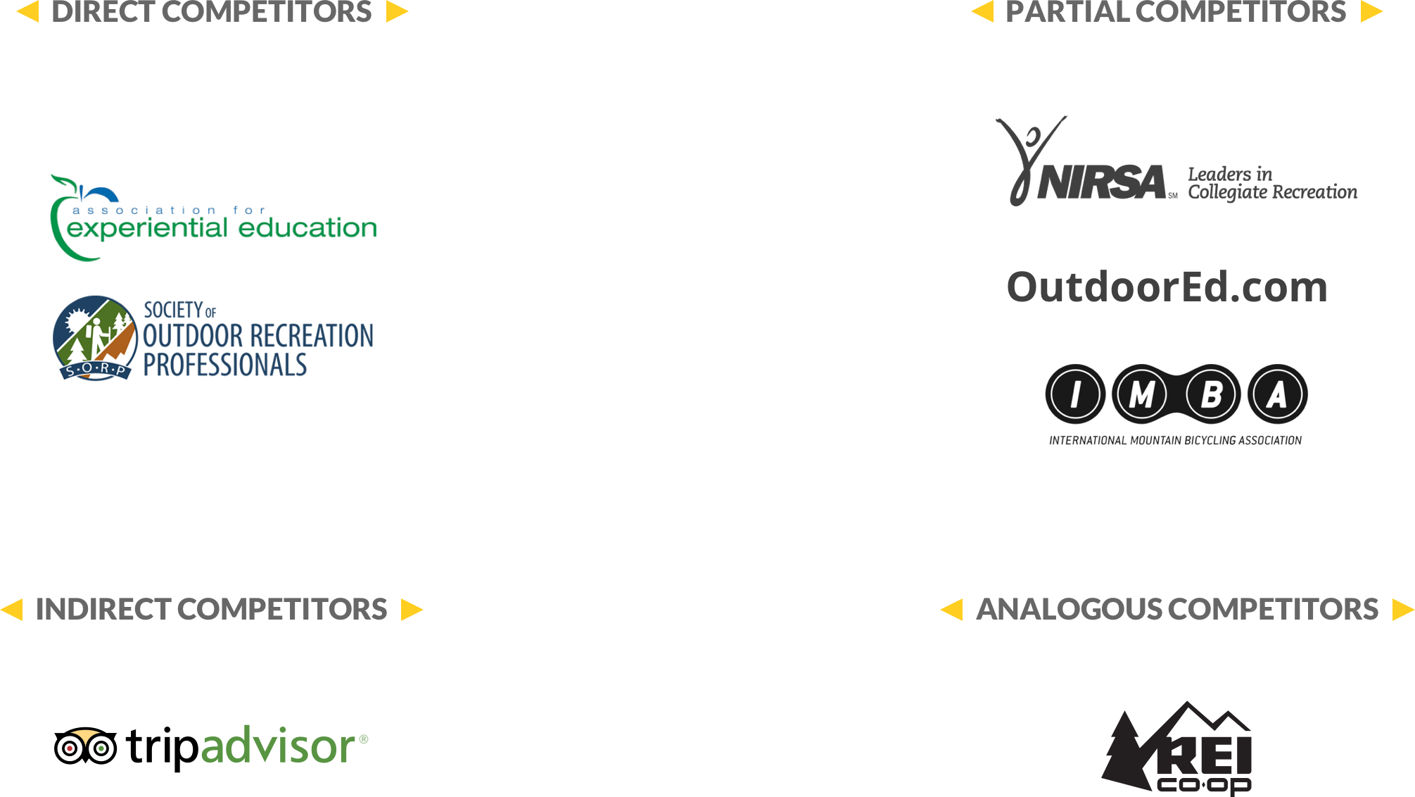
We conducted a comparative analysis to explore the possible solutions for the needs we discovered in the interviews. Our group brainstormed to further filter out our final list of competitors, and we tried to increase the diversity of the competitors.
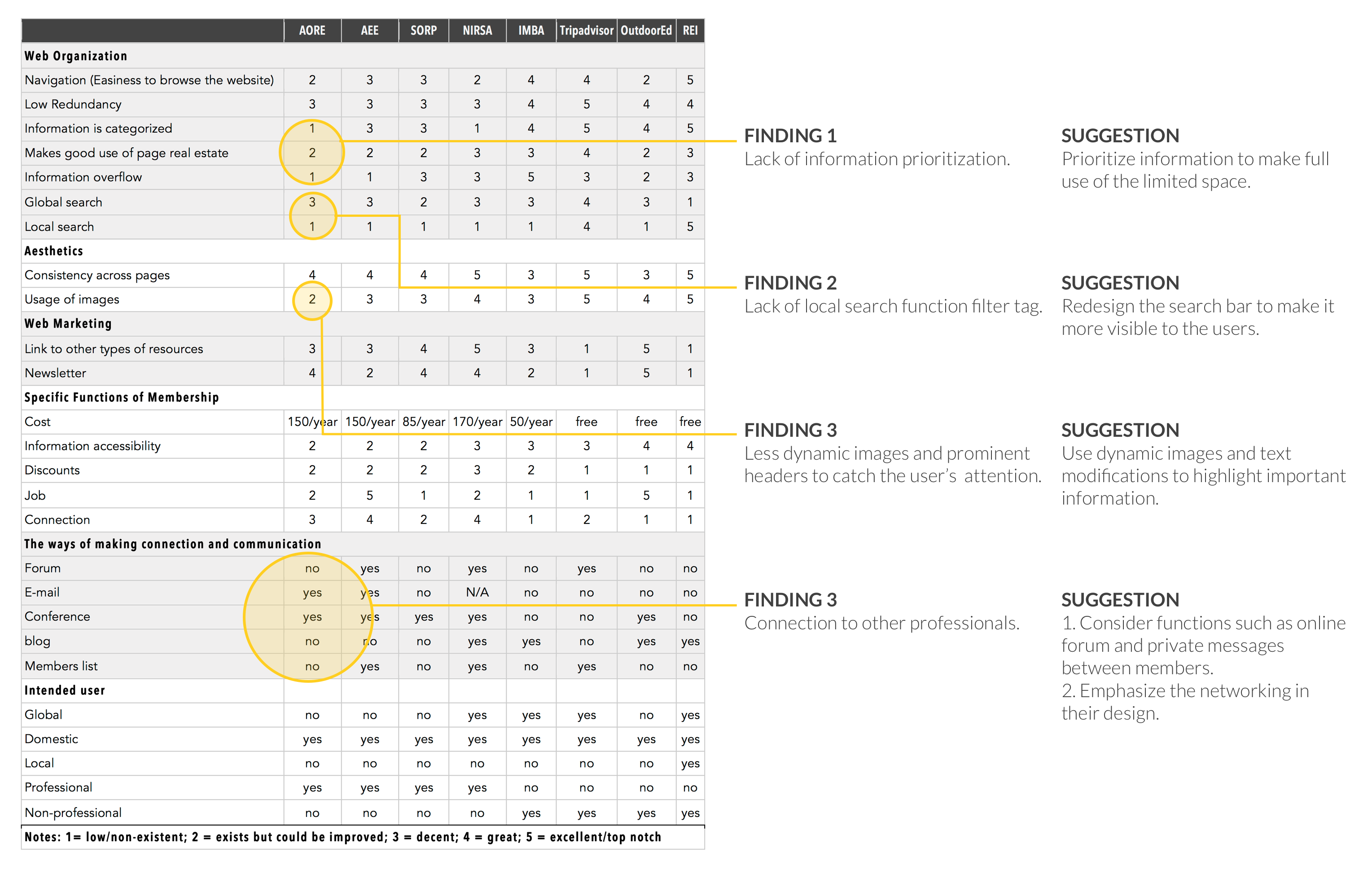
To evaluate the functionality and the interaction flow of the website, we used Nielsen's 10 heuristics.
Red: Severe usability problem.
To better understand the difficulties of interaction, we conducted usability tests with six participants including one pilot study.
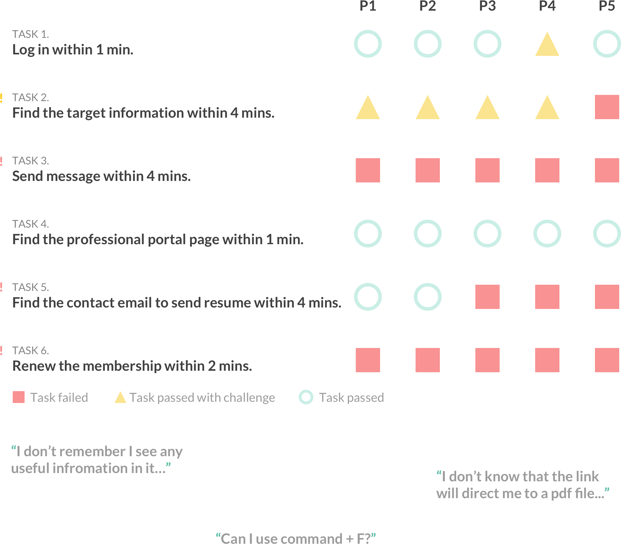
we were able to find the limitations of AORE’s current website. We identified six findings. There are findings that align with our previous findings in the heuristic evaluation and some new findings that were not revealed in the heuristic evaluation. We ranked the six findings by the severity: